Skip to content

Same business. Completely different first impression.

Six concepts built for the business categories we work with most. Each one starts from a believable outdated site and rebuilds it around what the business actually needs a visitor to do.

Illustrative mock-ups. The business names, logos, contact details, imagery and ratings shown are fictitious and exist for demonstration only. No real company is depicted, and any resemblance to an actual business is coincidental. These are concept redesigns, not client projects — we show concepts rather than borrowed logos or other studios' results, and will replace them with real work as it becomes available.

Plumbing company

Concept redesign

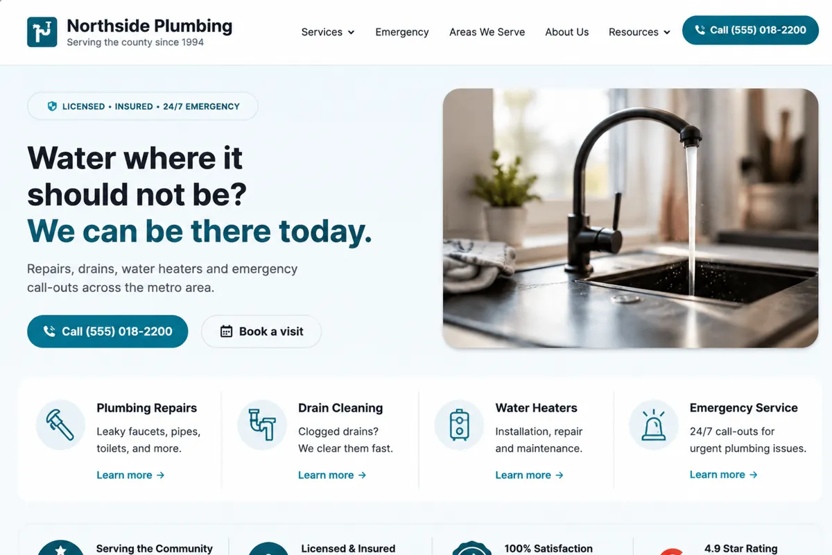
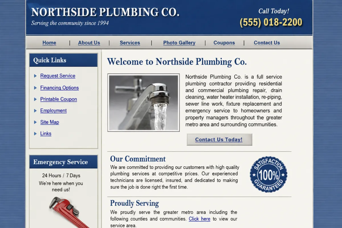
An emergency service business whose phone number was buried below the fold.

Before — the site today
After — concept redesign

What changed

  • Phone number became the primary action on every screen
  • Emergency service moved above the fold instead of into a sub-page
  • Six services untangled from one paragraph into scannable cards
  • Mobile layout designed for one thumb, not a shrunken desktop page
  • Service areas given their own structured, findable pages
Heating & cooling company

Concept redesign

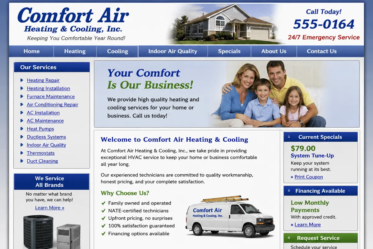
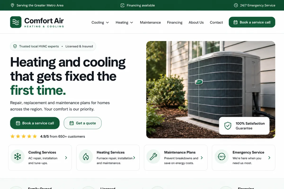
Seasonal demand, but no clear path from "my AC is out" to booking a visit.

Before — the site today
After — concept redesign

What changed

  • Seasonal services surfaced instead of hidden behind Heating/Cooling tabs
  • Booking replaced a generic contact form as the main action
  • Maintenance plans given a real page rather than a sidebar link
  • Readable type replacing 11px body copy
  • Structured service pages that describe each job properly

Roofing contractor

Concept redesign

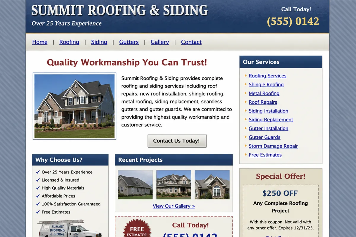
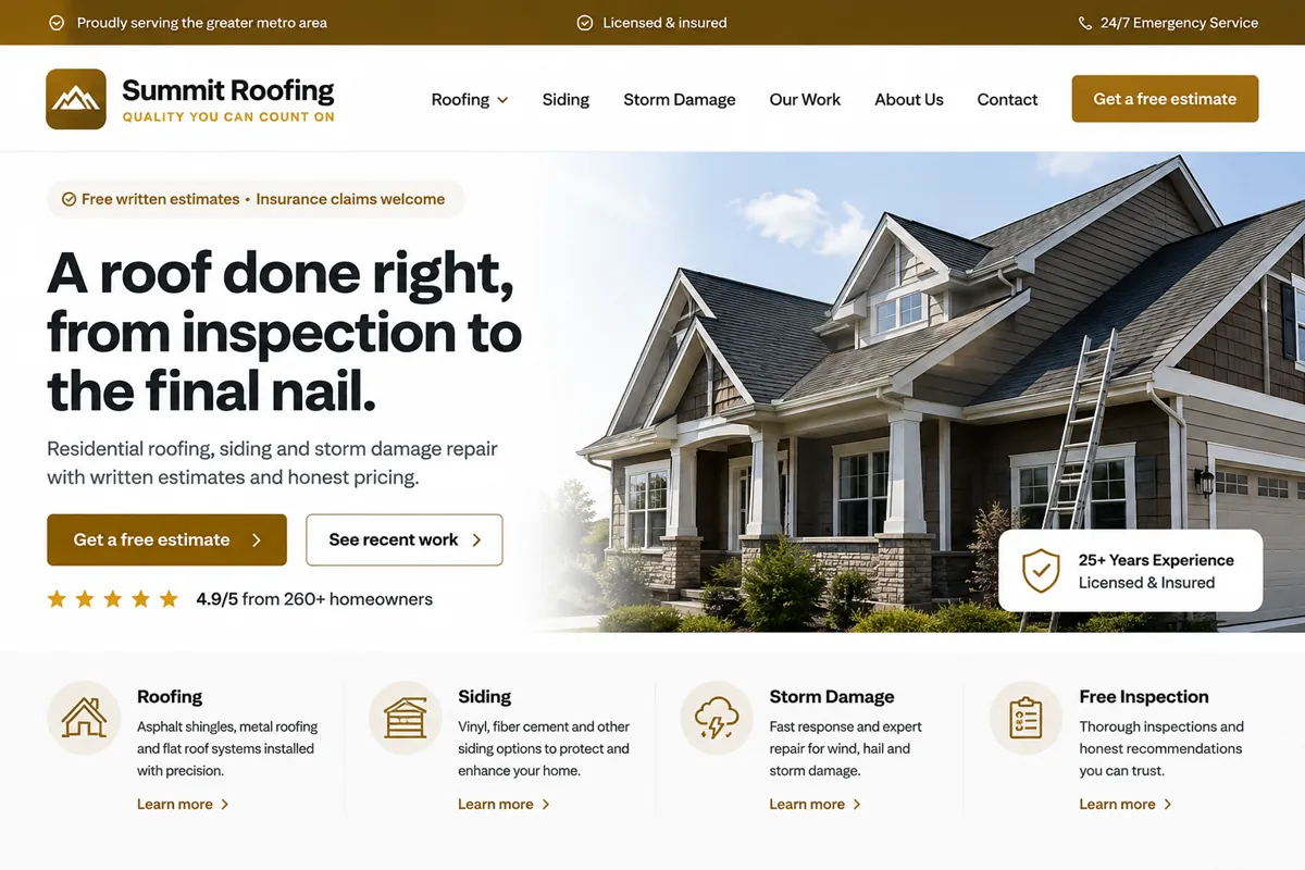
Strong local reputation, presented through a gallery no one could navigate.

Before — the site today
After — concept redesign

What changed

  • Project photography turned into a structured, browsable portfolio
  • Estimate request promoted from a nav item to the page-level action
  • Storm damage and insurance work given prominence in season
  • Trust signals the business genuinely holds moved into view
  • Mobile gallery that loads quickly instead of full-size photos

Dental practice

Concept redesign

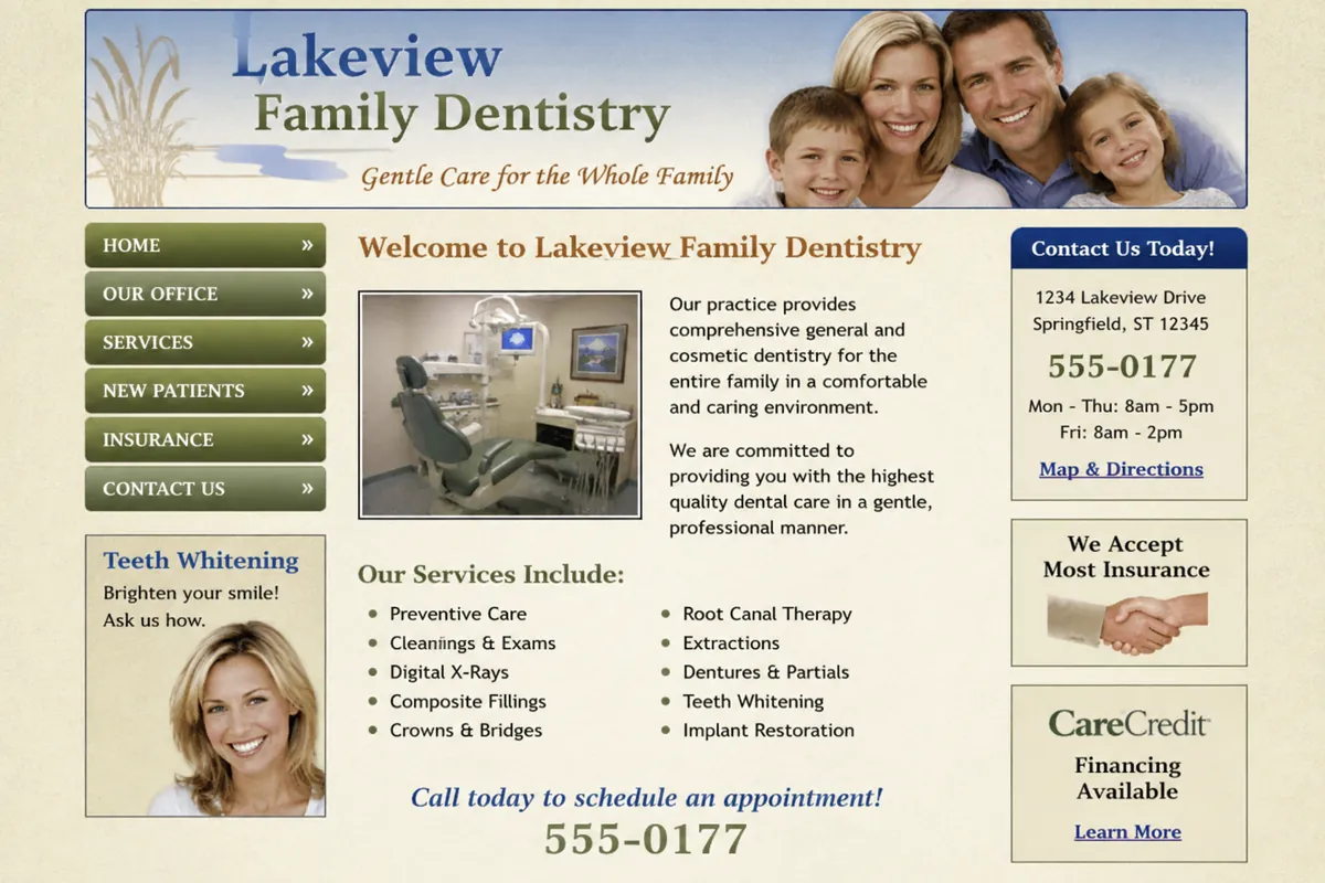
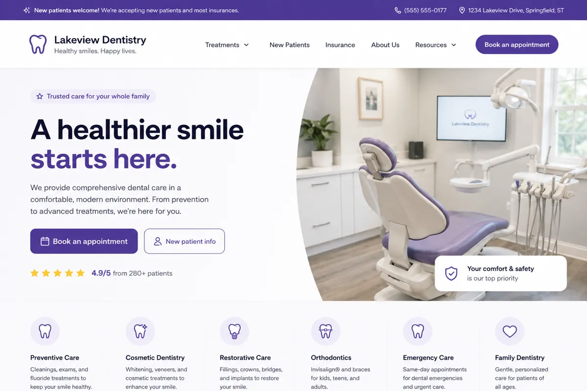
New-patient inquiries competing with a decade of clinical page copy.

Before — the site today
After — concept redesign

What changed

  • Booking replaced a printable PDF as the first step for new patients
  • Treatments separated into pages patients can actually search for
  • Insurance and hours moved out of a sidebar into clear content
  • Clinical wording translated into what a patient would ask for
  • Forms completed on a phone instead of printed at home

Law firm

Concept redesign

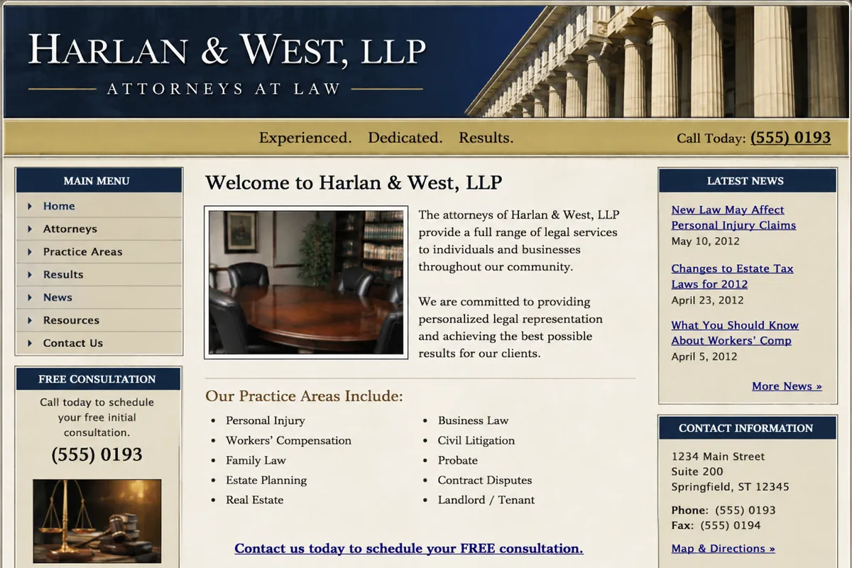
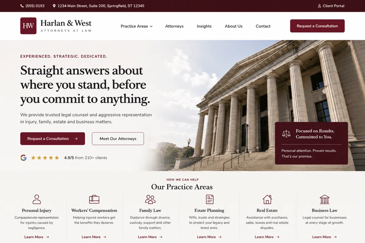
Credible practice, presented through dense text and a stock handshake photo.

Before — the site today
After — concept redesign

What changed

  • Each practice area given a page written for the person searching for it
  • Consultation request made the obvious action on every page
  • Attorney profiles built as real content rather than a single group photo
  • Long disclaimers kept, but moved out of the reading path
  • Legible line length instead of full-width justified paragraphs

Auto repair shop

Concept redesign

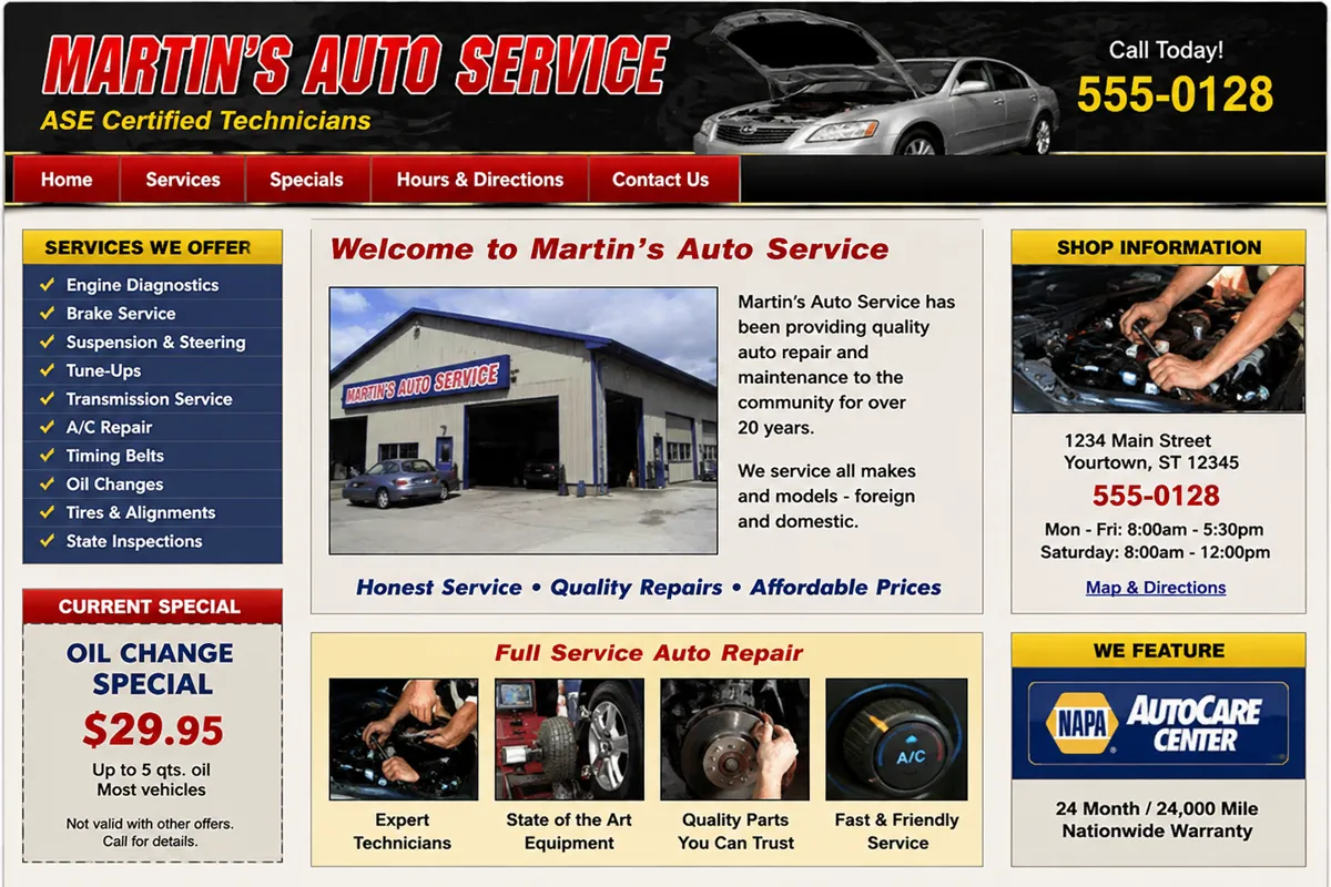
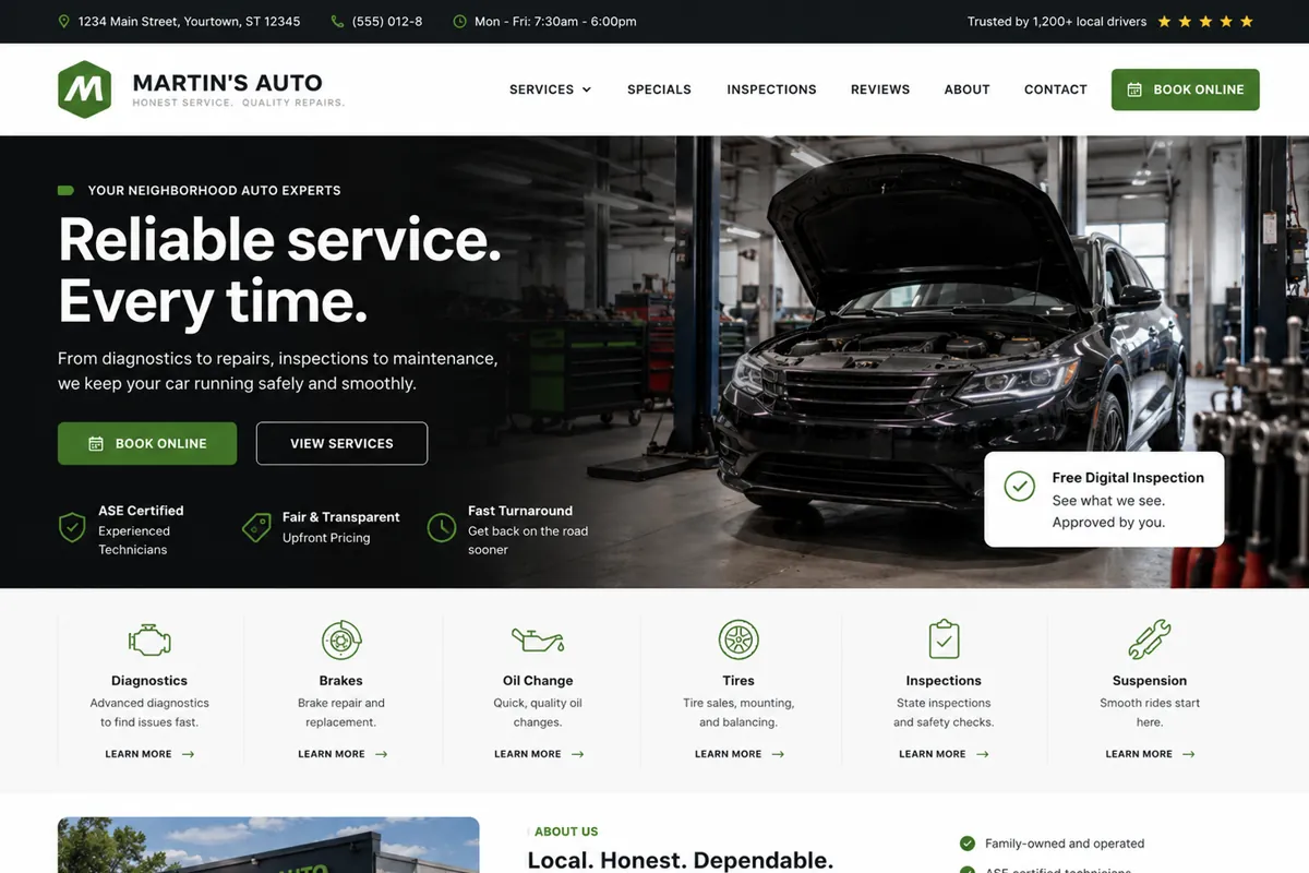
Loyal customers, but no way to book without calling during business hours.

Before — the site today
After — concept redesign

What changed

  • Online booking added so appointments are not limited to shop hours
  • Services grouped by what customers say, not by system name
  • Hours and directions surfaced instead of hidden on a sub-page
  • Specials handled as real content rather than a scanned flyer
  • Fast mobile pages for people checking from a parking lot

Curious what this would look like for your business?

Send us your current site and we will point out the changes that would make the biggest difference first.

No obligation, and no pressure to rebuild everything.