Site review — Northside Plumbing Co.
Thanks for sending this over. I went through the site the way a customer would — on a phone first, then on a desktop — and then looked at how it is put together underneath.
The short version: the business is in much better shape than the website. You are clearly established, you cover a wide area, and you do emergency work. A visitor cannot easily tell any of that in the first ten seconds, and the emergency work is the part being hidden most effectively.
Below is everything I found, in the order I would fix it. Not all of it needs a rebuild — the first two items are changes you could make on the current site this month.
What a first-time visitor notices, and what they miss
Fix firstThe page opens with a greeting rather than an answer. Nothing in the first screenful says what you do, where you do it, or that you come out today.
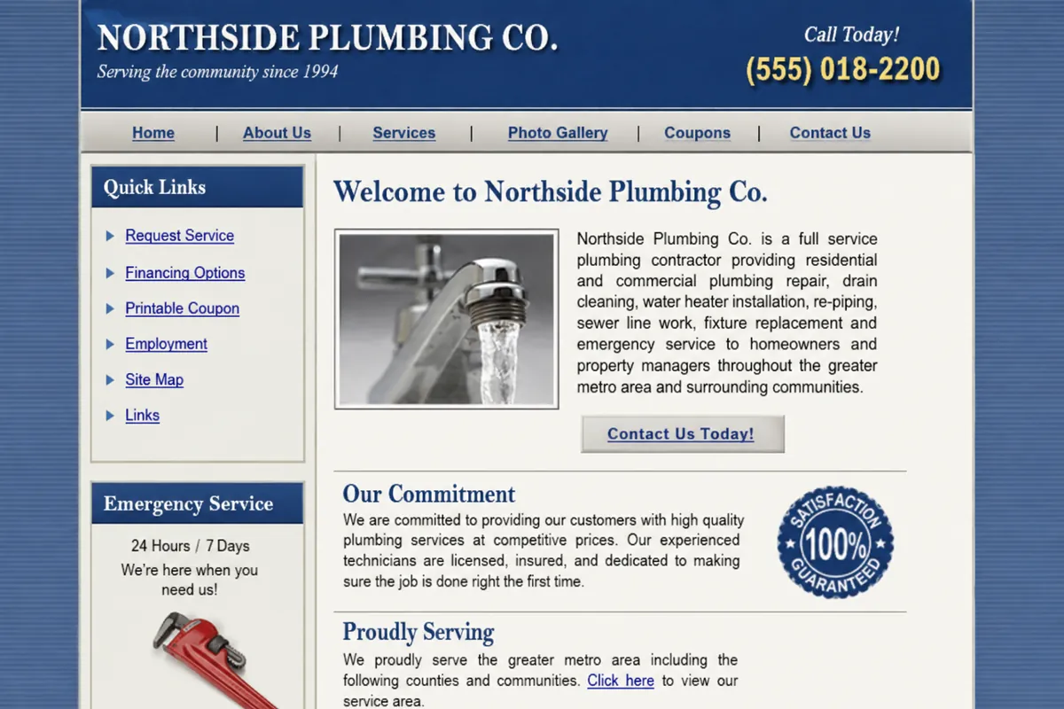
The headline is "Welcome to Our Website!" and the first paragraph is a 62-word sentence listing eleven services.
Why it mattersA visitor with a burst pipe has to read a paragraph to learn whether you handle burst pipes. Most will not — they will go back and click the next result.
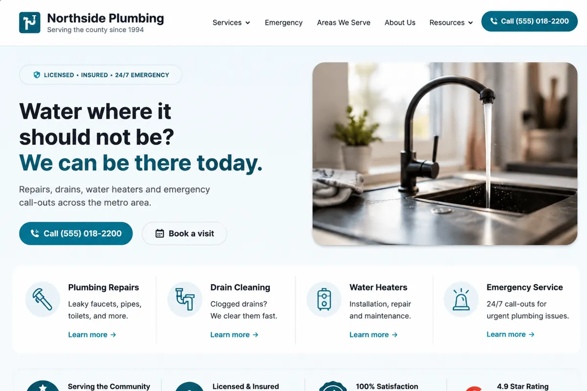
What we would doReplace the greeting with what you actually do and how fast: the service, the area, and same-day availability, in one line above the fold.
Emergency service is mentioned once, in the middle of that paragraph, and has no page of its own.
Why it mattersEmergency work is your highest-urgency, least price-sensitive traffic, and it is currently the hardest thing on the site to find.
What we would doGive emergency service its own prominent block on the homepage and its own page, with the after-hours number and what "today" actually means.
"Serving the county since 1994" is present but styled as a small strip under the logo.
Why it mattersThirty years in business is the strongest trust signal you have, and it is currently smaller than the navigation.
What we would doPromote it into the header area as a visible credential alongside licensing and insurance.
How the site behaves on a phone
Fix firstThe desktop layout is being scaled down rather than replaced. On a 390px screen the page is usable only by pinching.
The phone number in the header is part of an image, so tapping it does nothing.
Why it mattersThis is the single most expensive issue on the site. A visitor who is ready to call has to memorise the number, leave the page and dial it manually.
What we would doMake the number real text in a tel: link, and pin it to the bottom of the screen on mobile so it is reachable from any scroll position.
The layout is a fixed 980px table, so the whole page is zoomed out to fit and body text renders around 8px.
Why it mattersEvery visitor on a phone — which for emergency plumbing searches is most of them — starts by pinching to zoom before they can read anything.
What we would doRebuild the layout responsively, with the phone layout designed as its own thing rather than derived from the desktop one.
The "Quick Links" sidebar stacks below the main content on mobile, pushing the contact links roughly four screens down.
Why it mattersThe things a visitor most needs on a phone are the last things they reach.
What we would doDrop the sidebar pattern on mobile and surface Request Service and the phone number near the top.
Where the path to contacting you breaks down
Worth doing soonThere are three ways to contact you and none of them is presented as the obvious next step. Most pages end without one at all.
Service pages end with the last sentence of body copy — no call button, no form, no next step.
Why it mattersA visitor who has just finished reading about water heater replacement, at the highest point of intent on the whole site, is given nothing to do.
What we would doEnd every service page with the same clear pair of actions: call now, or request a visit.
The Request Service form asks for eleven fields, including preferred contact time and how you heard about us.
Why it mattersEvery field is a reason to abandon. The last two are useful to you and irrelevant to somebody standing in a flooded utility room.
What we would doCut to four fields — name, phone, address, what is wrong. Ask the rest when you call back.
No service area list exists anywhere, though the copy references "surrounding communities".
Why it mattersA visitor two towns over cannot tell whether to bother calling, and neither can a search engine.
What we would doPublish the actual towns you cover, as structured pages where the volume justifies it.
What is making pages slow to appear
Worth doing soonThe homepage is carrying about 6MB, almost all of it images uploaded at full camera resolution.
Eight photographs on the homepage are served at their original dimensions — several over 3000px wide — and scaled down in the browser.
Why it mattersOn mobile data the page takes several seconds to become useful. Emergency visitors are the least patient traffic you have.
What we would doCompress, convert to modern formats and serve each image at the size it is actually displayed. This alone accounts for most of the weight.
A visitor counter script and two analytics snippets load on every page; at least one points at a service that no longer exists.
Why it mattersRender-blocking requests that return nothing useful, plus a failed request on every page load.
What we would doRemove the dead scripts, keep whichever analytics you actually read.
Images have no width or height set, so the layout shifts as they arrive.
Why it mattersOn a phone, content moves under the reader — and sometimes under their thumb as they tap.
What we would doDeclare dimensions so space is reserved before the image loads.
The SEO structure underneath your existing pages
FoundationalThe foundations are weaker than the business deserves, but nothing here is damaged — it is mostly absent, which is easier to fix.
Nine pages share the title "Northside Plumbing Co. - Plumbing Services".
Why it mattersSearch engines have almost nothing to distinguish your water heater page from your drain cleaning page, and neither do people scanning results.
What we would doWrite a unique title and description per page, aimed at the person deciding whether to click.
Headings are chosen by size rather than meaning — the homepage has four H1s and no H2s.
Why it mattersThe document has no readable structure for search engines or screen readers.
What we would doOne H1 per page stating what the page is about, with a logical heading order beneath it.
Six services live on one page. There are no individual service URLs and no structured data of any kind.
Why it mattersEach service is competing with the others on a single URL, and search engines have to infer what the business does rather than being told.
What we would doGive each service its own page, and add Organization, Service and breadcrumb structured data.
The footer reads "Last updated: March 14, 2011" and a visitor counter shows 041973.
Why it mattersBoth quietly tell a visitor the business may not still be operating. This is a credibility problem more than a technical one.
What we would doRemove both.
If you only do three things
Make the phone number tappable
It is currently an image. This is a one-hour change on the existing site and it is almost certainly costing you calls today. Do this one before you decide anything else.
Put emergency service above the fold
Your most urgent, least price-sensitive traffic currently has to read a paragraph to find out you do this. Moving it up is a content change, not a rebuild.
Fix the images
Roughly 6MB of the homepage is photographs served at camera resolution. Compressing them is the single largest speed improvement available, and it does not require touching the design.
If you want, send back a note about which of these matter most to you and I will tell you what a scoped project would involve. If the honest answer is that the first three items are enough, I will say that instead.