Website redesign for law firms.
Someone with a legal problem is anxious, under time pressure, and reading your site at eleven at night. Dense justified paragraphs are not what that person needs.
Credibility written in a register nobody in trouble can read.
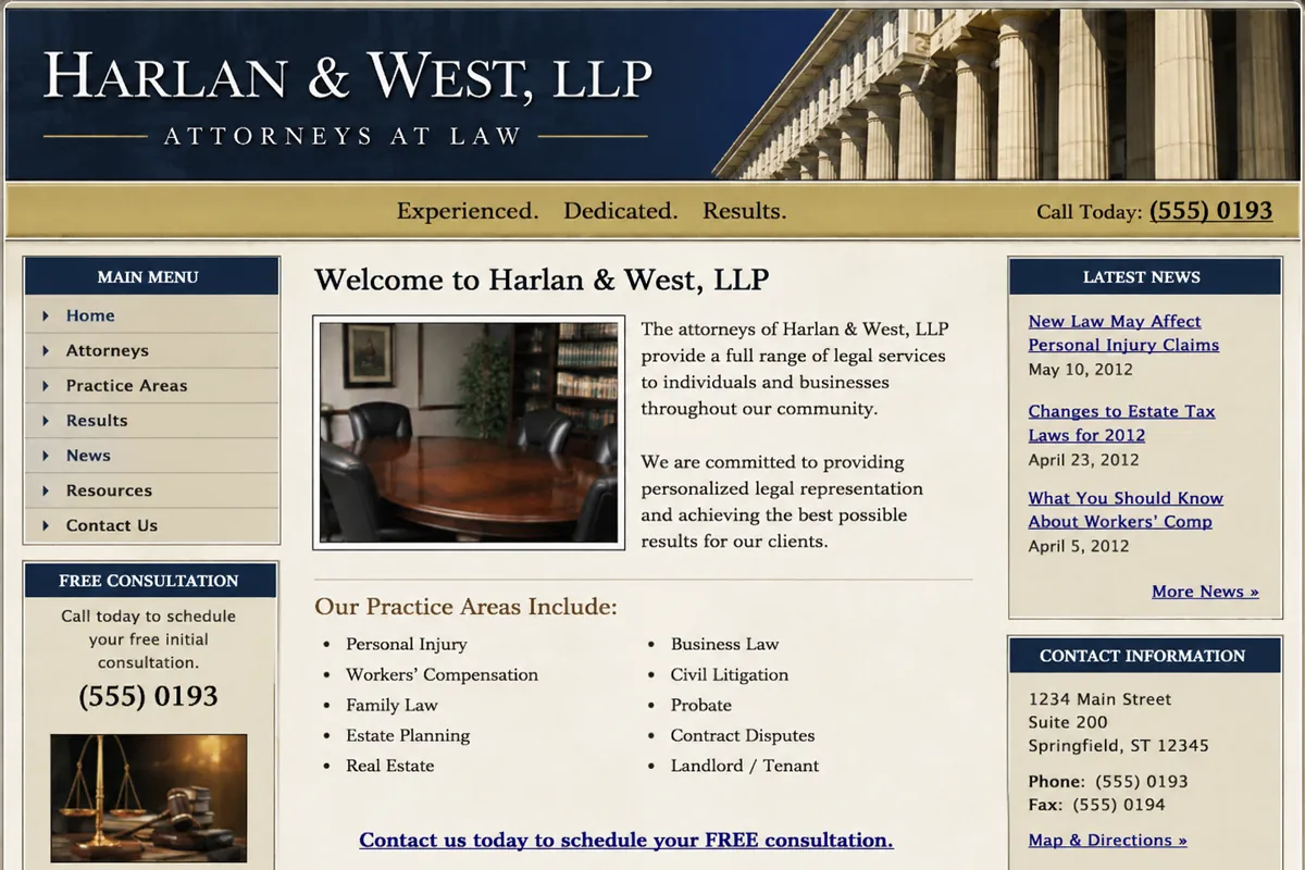
Law firm sites are often the most carefully written and least usable sites in this list. The copy is accurate, cautious and comprehensive — and set in full-width justified paragraphs under a stock handshake photograph, with the practice areas the firm actually earns from sharing a single page. The visitor is scared and skimming. The site is written to be defensible rather than to be read.
- Every practice area crammed onto one page, competing with itself in search
- Full-width justified text at a line length nobody can track
- A stock handshake or gavel photo where the attorneys should be
- "Contact us" as the only action, with no sense of what happens next
- Disclaimers occupying the most valuable space on the page
Three visitors, three different jobs.
A redesign that treats these as one audience serves none of them. Each gets its own path through the site.
The urgent matter
An arrest, an accident, a served notice, a deadline. They need to know you handle exactly this, that the consultation is free if it is, and how fast they can speak to somebody.
The researcher
Working out whether they even need a lawyer. They read several pages before contacting anyone, and genuinely useful plain-English content is what earns that contact.
The referral check
Sent by a friend and verifying you exist. Attorney profiles, bar admissions and a professional-looking site close this in seconds — or lose it just as fast.
What that looks like rebuilt.
A concept for law firm, not client work — the business is invented and the phone number is fictional.
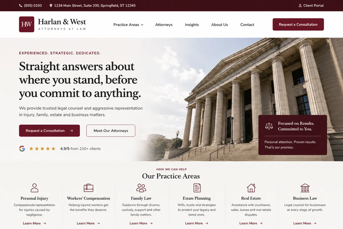
- Each practice area given a page written for the person searching for it
- Consultation request made the obvious action on every page
- Attorney profiles built as real content rather than a single group photo
Illustrative mock-ups. The business names, logos, contact details, imagery and ratings shown are fictitious and exist for demonstration only. No real company is depicted, and any resemblance to an actual business is coincidental.
What gets fixed first.
In order. The review tells us how much of this list your site already handles.
- Each practice area given its own page, written for the person searching it
- Consultation request made the obvious action on every page
- Real attorney profiles replacing the stock photography
- Readable line lengths and left-aligned text instead of justified blocks
- Required disclaimers kept in full, but out of the reading path
What law firms ask us.
How do we stay within our bar association advertising rules?
Required disclaimers, attorney advertising notices and jurisdiction statements stay on the site in full — we move them out of the primary reading path rather than out of the page. Your compliance obligations are yours and we build to whatever your state bar requires; nothing we write is intended as legal advice about your own advertising.
Can we publish case results?
Only if your jurisdiction permits it and the accompanying disclaimer runs with it. Where results cannot be published, the honest substitutes are clear explanations of process, attorney credentials and genuinely useful content — which tend to convert better than a results page anyway.
Do we need a blog?
You need answers to the questions clients actually ask, which is not the same thing. Five thorough, permanent pages answering real questions in your practice areas will do more than forty short posts about legal news nobody searched for.
The same problem, different business.
Want this for your law firm?
Send us your current site and we will tell you which of the changes above would make the biggest difference first.
No obligation, and no pressure to rebuild everything.