Website redesign for dental practices.
A new patient wants to know three things: do you take my insurance, can I get an appointment, and will this be unpleasant. Most practice sites answer none of them quickly.
The new patient journey still begins with a printable PDF.
Dental sites tend to be written by the practice for the practice: a services list in clinical language, a new patient section that asks you to print and complete forms, and insurance information that says "we accept most major plans". Every one of those is a small ask, and the visitor is on a phone, at night, deciding between you and two other practices with the same three problems.
- New patient forms as a PDF to print at home, in a house with no printer
- "We accept most major insurance" instead of naming the plans
- Treatments listed as composite restorations rather than fillings
- No online booking, so the first step is a call during working hours
- Anxiety — the actual reason many people delay — never addressed at all
Three visitors, three different jobs.
A redesign that treats these as one audience serves none of them. Each gets its own path through the site.
The new patient
Recently moved, changed insurance, or finally getting round to it. Whether you take their plan and whether they can book without phoning decides this in under a minute.
The specific problem
Pain, a chipped tooth, a crown that came off. They search the symptom, not the procedure. Pages named the way patients describe things are what get found here.
The elective decision
Whitening, veneers, implants, aligners. A considered, largely self-funded purchase where clear pricing, real before-and-after work and financing matter more than clinical detail.
What that looks like rebuilt.
A concept for dental practice, not client work — the business is invented and the phone number is fictional.
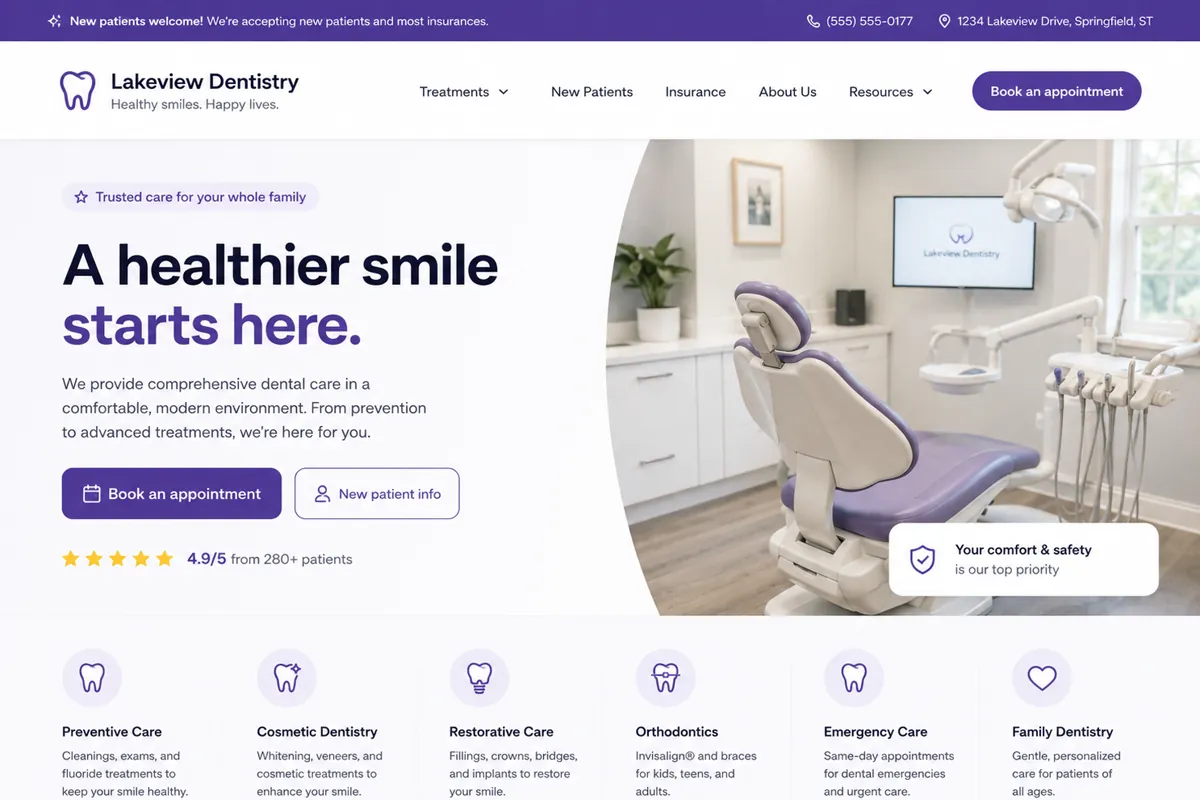
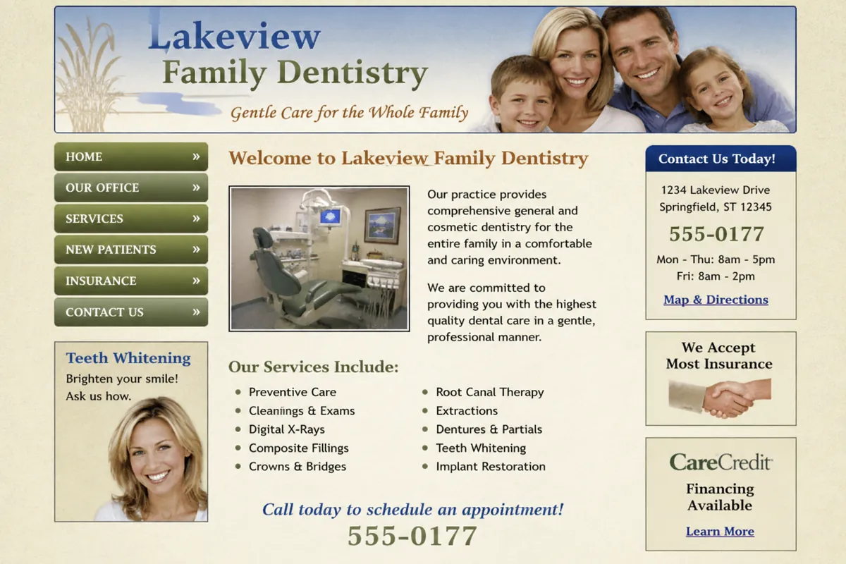
- Booking replaced a printable PDF as the first step for new patients
- Treatments separated into pages patients can actually search for
- Insurance and hours moved out of a sidebar into clear content
Illustrative mock-ups. The business names, logos, contact details, imagery and ratings shown are fictitious and exist for demonstration only. No real company is depicted, and any resemblance to an actual business is coincidental.
What gets fixed first.
In order. The review tells us how much of this list your site already handles.
- Online booking as the primary action, replacing the printable form
- Insurance plans named on the page rather than gestured at
- Treatment pages titled the way patients actually search
- Forms completable on a phone before the first visit
- Anxiety and comfort addressed directly, because it is why people delay
What dental practices ask us.
Does the site need to be HIPAA compliant?
The marketing site itself generally does not handle protected health information — but the moment a form collects symptoms, or booking captures patient details, that changes. We keep intake inside your practice management or booking system, which is already covered, rather than building a form that quietly creates an obligation you did not plan for.
Can it connect to our practice management software?
Booking integrations for the common platforms are standard work. The aim is that a patient books from your page in your branding, instead of being handed off to a third-party screen that looks nothing like the site they were just on.
Should we list prices?
For elective treatments, usually yes — whitening, aligners and implants are shopped on price and a range gets you into consideration. For insurance-led general dentistry it is rarely useful, because the real answer depends on the plan. We would rather answer the insurance question well than publish a number that misleads.
The same problem, different business.
Want this for your dental practice?
Send us your current site and we will tell you which of the changes above would make the biggest difference first.
No obligation, and no pressure to rebuild everything.